Tertia
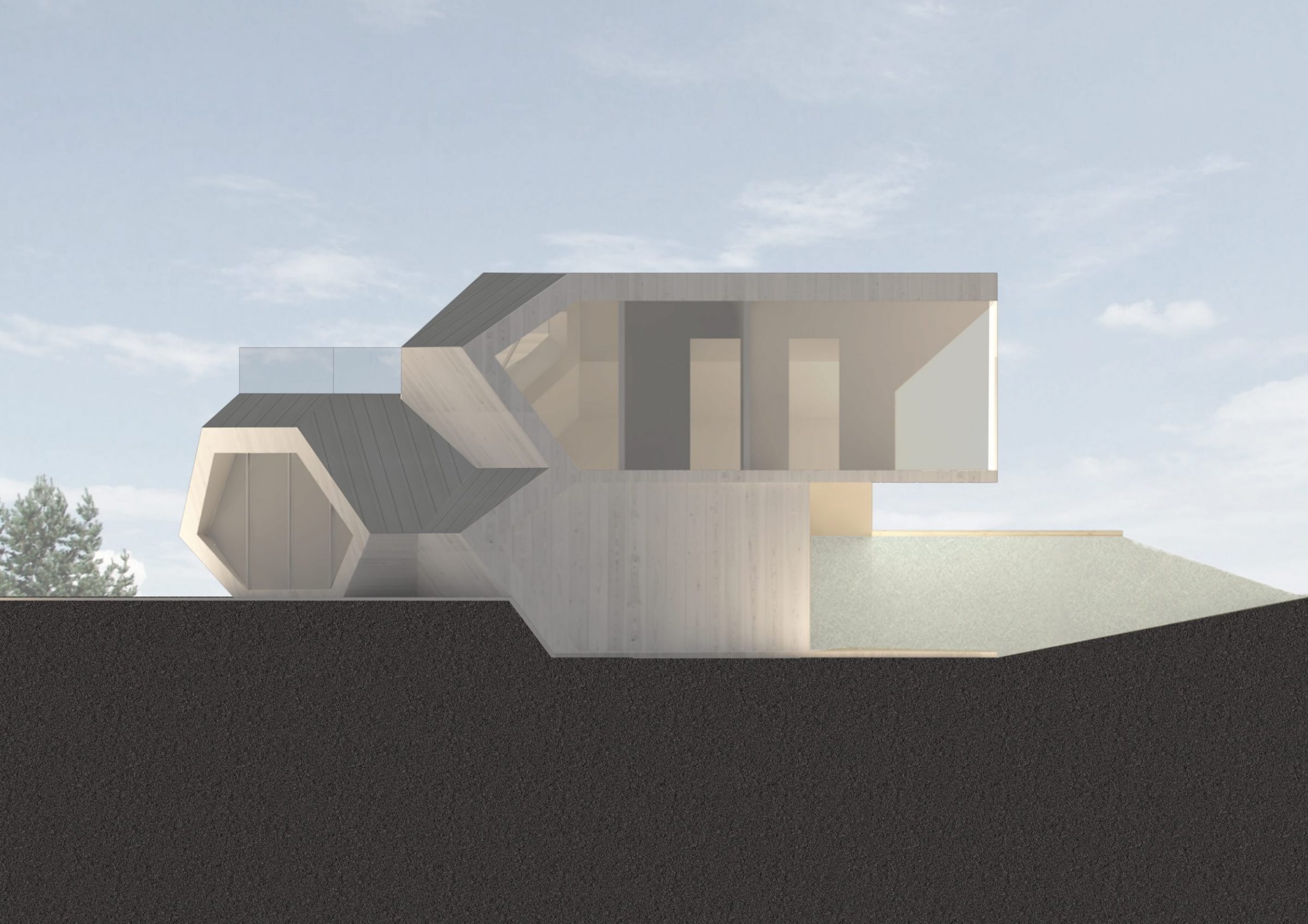
The design of the modular house was based on the client’s wish to get a building creating a visual identity. In order to stand out from the abundance of pragmatic minimalist prefabricated box buildings available in the market, PART architects built their volume on a clipped octahedron allowing to create more stimulating situations than a cuboid both in interior and exterior spaces.
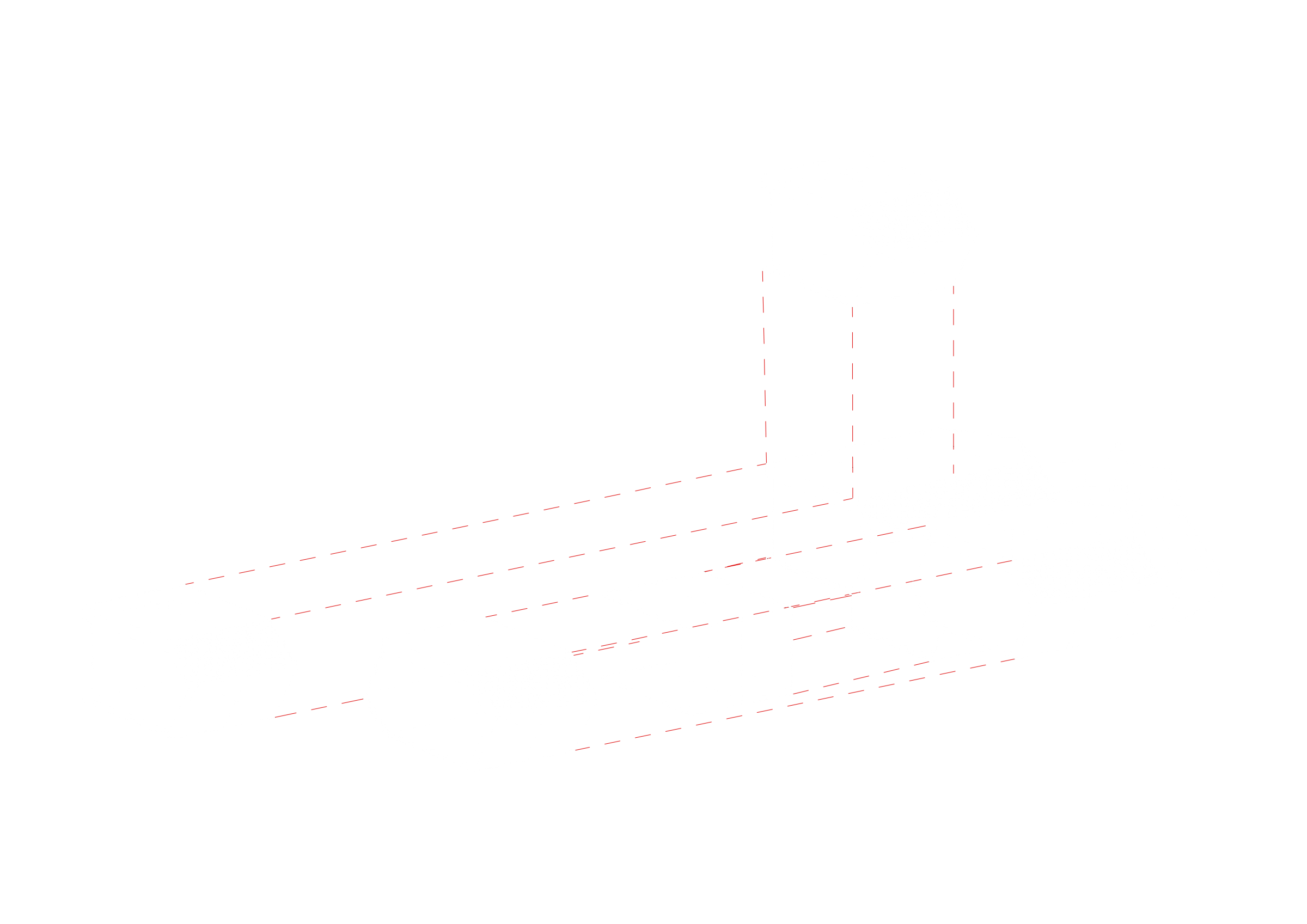
The name Tertia comes from Latin signifying a third. The most interesting feature of the building is its spiral growth by thirds of floors. There is a staircase in the middle of the building leading to a new plane at every 94 cm thus creating a vertically appealing space for various functions that can also be used for seamless movement from the cellar to the roof terrace.
The exterior space
In the exterior space, the building’s geometry divides the plot into areas of different character. The entrance is located on the lower-ground floor level with a ramp leading to the sauna and technical rooms 94 cm below. The lowered area next to the building has room for parking and a somewhat sheltered sauna terrace. The living room and kitchen are 94 cm above the ground. At the same level, there is also the terrace extending the living room and allowing a better view of the plot. If buildings usually tend to be simple boxes and the surrounding space must be designed with plants and garden furniture, then Tertia accentuates the plot not only horizontally but also vertically – creating open-air spaces. This is crowned with the roof terrace that similarly to the surroundings has three levels.
The interior space
The entrance leads to a spacious hall with a large wardrobe and toilet. A third of a floor below, there are the sauna and functional rooms (laundry, technical facilities). Less than a metre above the entrance lie the kitchen, dining and living rooms. The bedrooms, bathroom and play area/study are located on the third level leading also to the roof terrace. There are wide stairs between all floors suitable for shelves, seating or integrated furniture. The slanted and straight walls can be combined in a way that the folded walls accentuate and enrich the room while also providing vertical circulation. Most interior walls are still vertical at the right angle thus allowing the room to be freely modified with furniture.
Client:
Palmatin OÜ
Floor area:
100 m2
Function:
private house
Design:
2018
Construction:
2018
Architects:
Sille Pihlak and Siim Tuksam (PART)
Team:
Ivo Heinrich Arro (PART)
Construction:
Viljar Sepp (Klamber OÜ)
Energy efficiency:
Kaiko Kivi (Mudel arhitektid)


